
Horizontal Centering
Introduction
In this article, we will focus on this property:
margin-inline: auto;The Problem

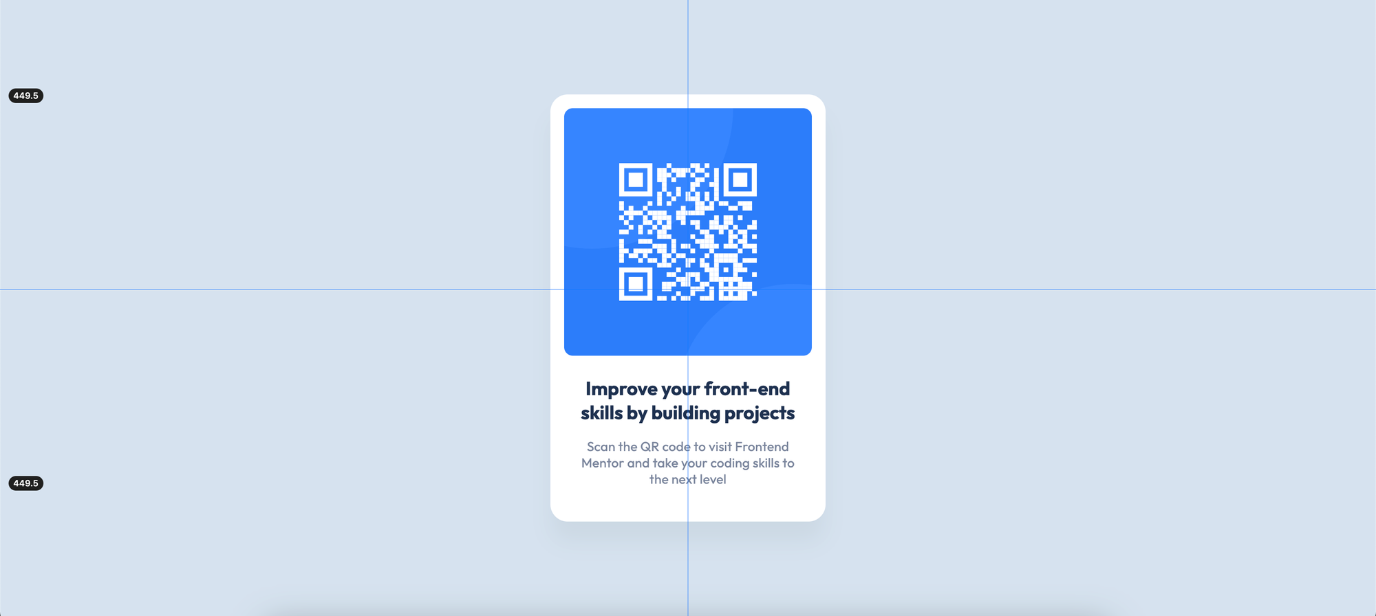
We must center our main element as horizontal for this challenge.
The Solution
We can use this rule set to center the main element as horizontally within the containing block:
<body>
	<main>
		<!-- The project code -->
	</main>
</body>
main {
max-inline-size: 20rem;
margin-inline: auto;
}
We can use margin-inline: auto; to center our main element. We should also limit our main element to center it within its containing block with max-inline-size: 20rem;. Otherwise, margin-inline: auto; will not work.
Questions
1 - I use margin-inline: auto;, but it doesn't center. Why?
If we use margin-inline: auto; without an explicit inline-size or max-inline-size value for our main element, margin-inline: auto; will render 0, so it cannot center the main element. We should use inline-size or max-inline-size with margin-inline: auto; to center it.
2 - I use text-align: center; to center an element, but it doesn't work, why?
text-align: center; only works for text, not for container elements like div or main. We can use text-align: center; to center the text within its inline axis, not the element itself.
3 - Why should I use max-inline-size? What happens if I use inline-size?
We can use inline-size, but it breaks the responsive behavior of HTML. max-inline-size is a more appropriate property.
4 - Can I use display: flex; or display: grid; to center an element horizontally?
display: flex; or display: grid; properties are not suitable styles for simply centering an element horizontally. They have some complex rules we should know. Using simple properties for simple tasks is a better choice.
5 - Can I use 320px instead of 20rem?
Yes, we can use the pixel length unit instead of rem. However, the pixel length unit is an absolute length unit, so it doesn't change its size. The rem unit is for root em, and it can change its size. For more responsive behavior, we can use rem instead of pixel.
6 - Can I use margin: 0 auto; and max-width instead of margin-inline: auto; and max-inline-size respectively?
margin: 0 auto; and max-width refer to the physical directions of elements. margin-inline: auto; and max-inline-size refer to the logical directions. For more modern websites and products, we can use the latest features.
Further Reading
- Logical Properties
- Sizing Units
- How To Center a Div
- CSS: The Definitive Guide, 5th Edition (Chapter 6. Basic Visual Formatting)
Ask Questions
If you have any questions, please don't hesitate to ask!